- Blog
- 30 abril 2025
Share this news

PH7, the new image of a growing brand
We are launching a new brand at Seafood Expo Global 2025.
With a new positioning that focuses on innovation, specialization and customized service.
At PH7 we have been renewing our formulas for more than 25 years. Now it is time to renew our image as well, updating it with a new identity that reflects the present and the future of a growing brand: more innovative, more specialized, more open and closer.
A new brand context
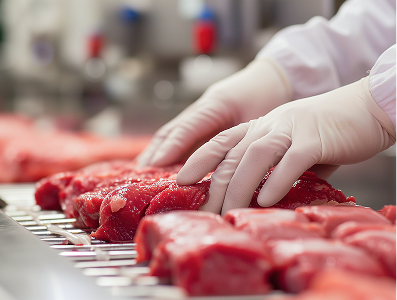
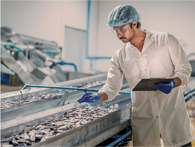
At PH7 we develop, produce and offer high quality food solutions for the seafood sector and now also for the meat sector. We are entering a new market with solutions adapted to fresh and cooked products and with the firm intention of expanding our offer in the future.
New markets and new services, with the development of tailor-made formulas, pilot plant testing of solutions, technical advice and consulting.
We develop customized formulas and adapt our more than 300 formulations according to the specific needs of our customers, adapting to the processes, legislation, the species to be treated and the desired results.
With a global presence in more than 32 countries and an annual production of 5000 tons, we have a state-of-the-art pilot plant to test the application of our customers’ solutions on their raw materials.
In this new market context, we became the R&D&I team, the laboratory, the pilot plant and the process consultant for food companies in the seafood and meat sectors.


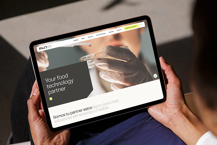
A new identity and a new positioning: Your Food Technology Partner
This internal transformation process has led us to reformulate our brand, positioning us beyond food additives. PH7 is innovation, quality, personalized service and the best partner to create customized food solutions.
And it has also led us to update our entire corporate identity, with a new logo, new colors and a more iconic, visual and direct language.
We have completely renewed the color palette. The main colors of the new identity are Black and Sand (beige). Its complementary colours are aqua (drawing from the sea and the ocean, representing its experience with fish and seafood), terra (from the land and animals, reflecting these new markets) and yellow (which represents R&D and technology, symbolizing the brand’s non- conformist spirit of innovation).
The result is a much more contemporary visual identity that also bolsters PH7’s ambition to continue being a prestige brand in the food solutions sector.
Seafood Expo Global 2025 was the place chosen to present this new corporate identity to the public.
Discover the new PH7.
Discover Your Food Technology Partner.


